
Over the past few years, I’ve had the privilege of working with King’s Hawaiian, helping bring their signature sweet bread to life through photography. It’s a brand that holds a special place in a lot of hearts, mine included, and every shoot has felt like a chance to contribute to something beloved and iconic. But nothing quite compares to the recent opportunity I had to collaborate with their in-house creative team and agency partners at The Wilson Group on the brand’s exciting rebrand.

When the updated brand guidelines landed in my inbox, I felt a real jolt of excitement. It was like getting a peek behind the curtain at a much-anticipated show. Liz Bonder and her team had been crafting something bold and thoughtful, a fresh take that was both modern and timeless. The new fonts and logos felt familiar yet elevated, and the packaging struck this perfect balance of clean and contemporary, but still full of the warmth and joy that makes King’s Hawaiian, so special. There was a nostalgic energy in it, but also a sense of momentum. A brand rooted in tradition, stepping confidently into its next chapter.
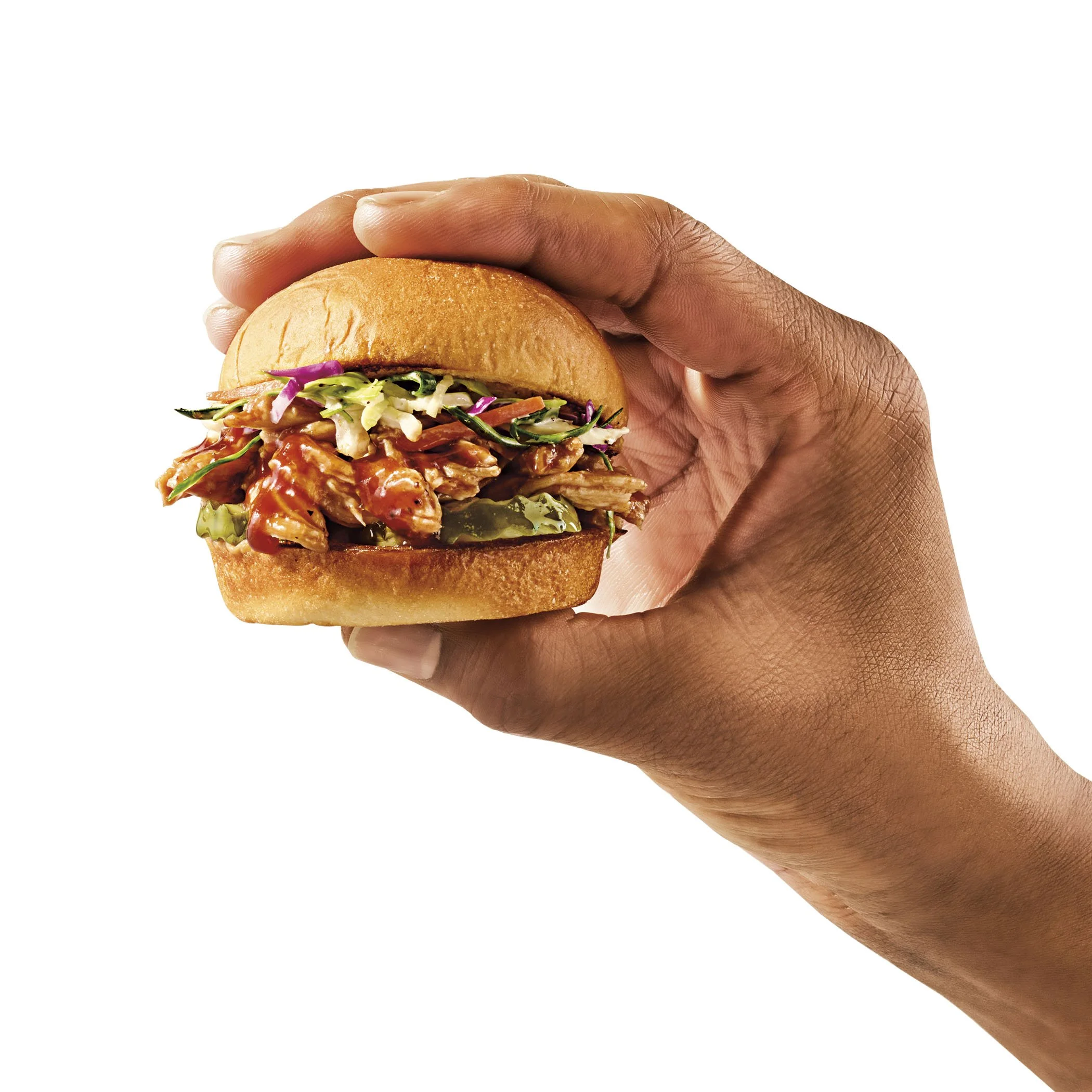
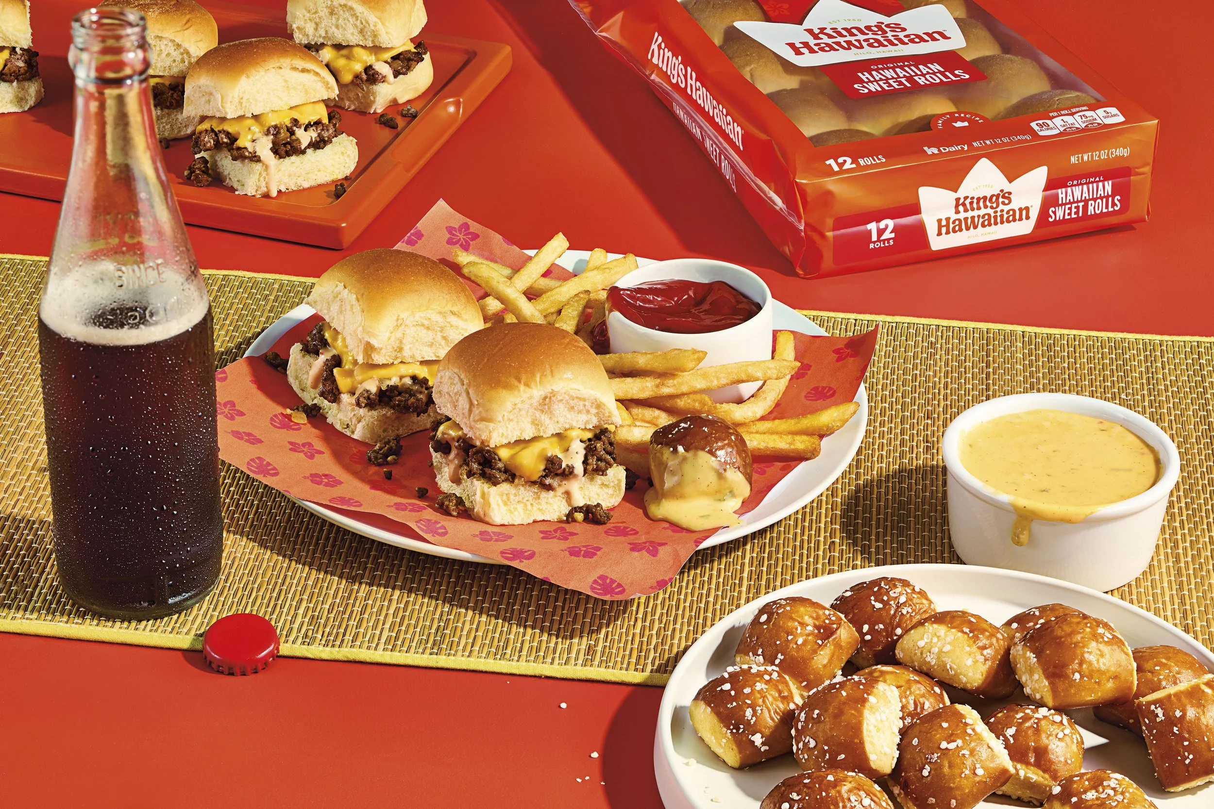
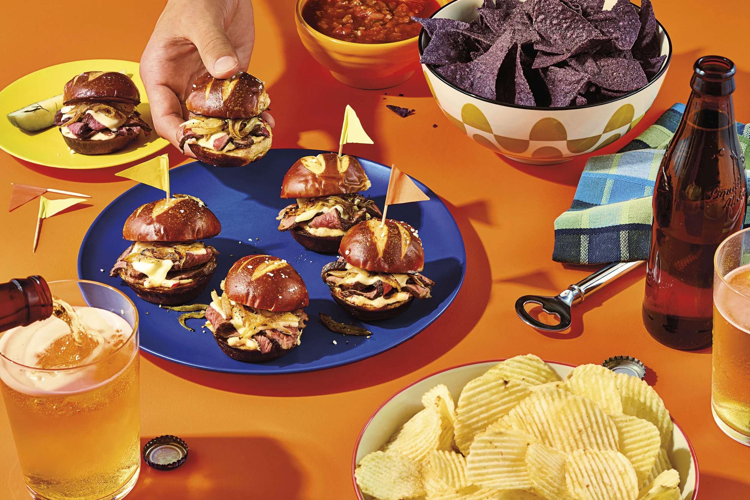
From a photography standpoint, the shift was inspiring. Traditionally, the visual language had leaned toward a more polished, almost pristine approach with highly curated styling, in-depth retouching, and that classic “perfect” product look. It was beautiful work, but this new direction opened the door to something looser and more alive. The goal now was true appetite appeal. Real bread. Real texture. Real life. The styling became more natural, more playful. Lighting leaned directional and dynamic, with intentional shadows and contrast that added dimension and warmth. It was about letting the product breathe, allowing imperfection to work for us rather than be something to avoid.
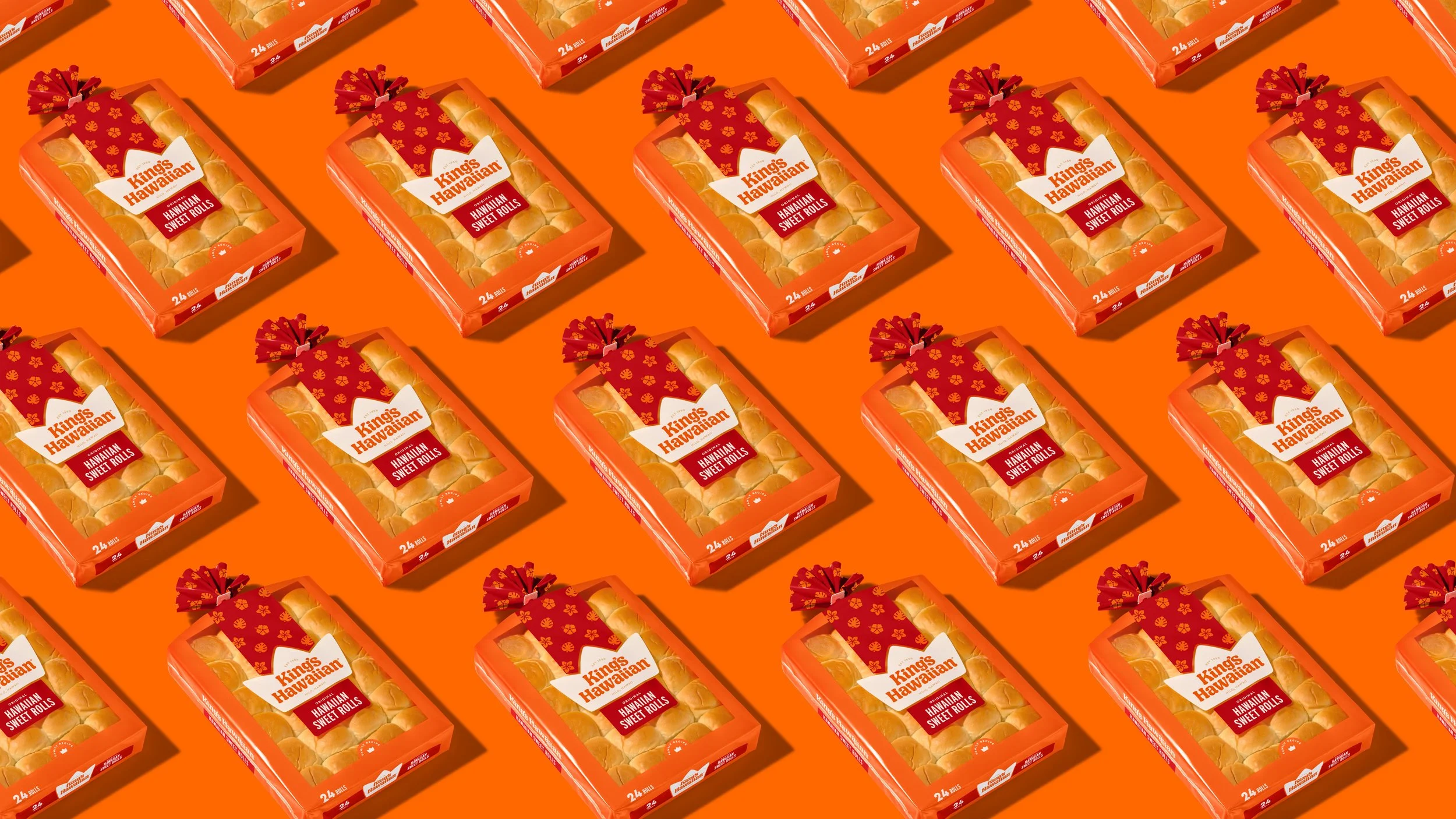
We paired this realness with strong graphic set design, fully embracing the brand’s iconic orange and the expanded color palette that came with the rebrand. It was a blast to play in that space. Taking something organic and placing it within a modern, energetic frame that still felt undeniably “King’s.”

One of the most interesting challenges came during the product family packaging shoot. We were working with actual bags, (real packaging, not renders) and the task was to present them in a way that was clean and cohesive, without stripping away the tactile truth of the product. It was a delicate dance between precision and authenticity. The result, though, was incredibly satisfying. There’s something rewarding about capturing that line where something feels real and crave-able, but still brand-right and campaign-ready.


Seeing it all come together for the rebrand launch was a proud moment. So many smart, creative people poured their hearts into this, and to be even a small part of it was an honor. I’m excited for where the brand is headed and incredibly grateful to continue collaborating with such a thoughtful and passionate team.
Here's to more shoots, more stories, and more sweet rolls.